Product builders tend to talk about results, not the awkward parts. I want to do the opposite.
Before LickMV launched, we ran many internal tests and hit many problems. Some were technical, some were product judgments, and some are a little embarrassing. But they are more useful than a polished success story.
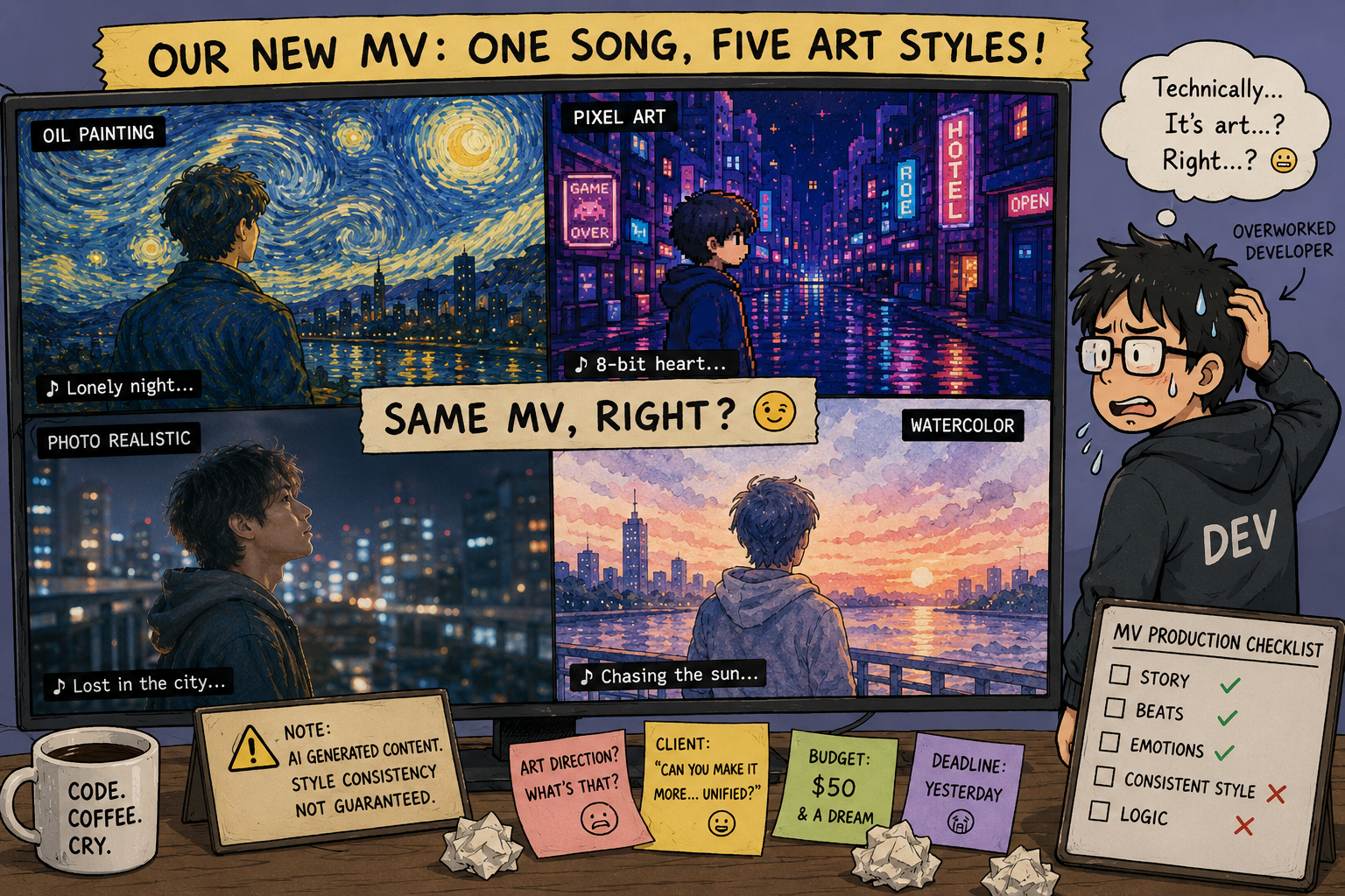
In early versions, every AI storyboard image could have a slightly different visual style. To us, it looked “usable enough.” To real users, it felt like several unrelated videos had been cut together.
That feedback hurt because it was true. A music video needs a sense of wholeness. We spent a lot of time improving consistency, and it is much better now, but I would not claim it is completely solved.
Early on, we considered letting users upload their own materials and mix them with AI-generated content. It sounded reasonable: more freedom, more control. But in practice, it made the product complicated.
The users who need LickMV most are often people who want to make something quickly without knowing editing tools. Too many options became a burden. We cut the feature. Cutting features hurts, but this one was right.
At first, we emphasized one-click generation. Testing showed that satisfying results usually needed at least one or two rounds of style adjustment. Fully automatic output was not always accepted because AI did not know the exact feeling users wanted.
So we kept several key points where users can intervene. The better positioning became AI-driven, human-reviewed. After that change, satisfaction improved.
Every “this part feels wrong” is more valuable to us than five vague compliments.
Question: if you have used LickMV, which step should we improve next?